Google's music platform YouTube Music released a major interface update on June 17, 2026, catching users by surprise. The company has made sweeping changes to both Android and iOS apps, completely overhauling the experience by relocating the search button and integrating Explore content directly into the main screen. This update follows gradual testing that began last year in 2025 and is now finally rolling out to all users worldwide.
What Has Changed in the Interface?
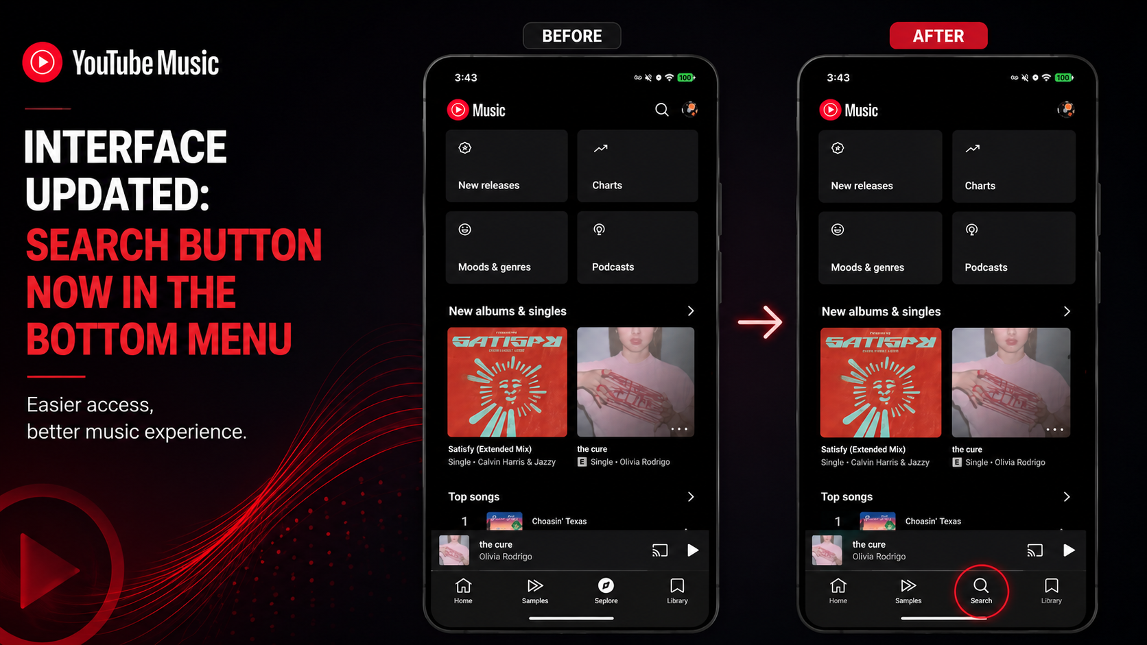
The most noticeable change in the new YouTube Music interface is the relocation of the search button from the top bar to the bottom navigation menu. The magnifying glass icon, which used to sit fixed at the top of the screen, now lives alongside the Home, Explore, and Library tabs — within easy thumb reach. This move aims to improve one-handed usability on smartphones with ever-growing screen sizes. According to Google's user research, 67% of users performed in-app searches at least five times daily in 2025, making accessibility a critical priority.
Additionally, the bottom navigation bar has been restructured. Previously offering five distinct tabs (Home, Explore, Library, Upload, Premium), it has now been streamlined to four primary items: Home, Search, Explore, and Library. The "Upload" and "Premium" options have been moved into the profile menu, simplifying the interface. The design language adopts Material You 3.0 principles, with a dynamic color palette that adapts to the user's wallpaper and softer visual details like rounded corners and subtle shadows.
The Strategic Relocation of the Search Button
Google's strategy behind this change is clear: guiding users toward faster content discovery. While the new placement resembles the bottom search bar model Spotify adopted in 2024, YouTube Music combines the search experience with voice commands and AI-powered suggestions. Test data indicates that the bottom-menu search button has increased click-through rates by 23% compared to its top-positioned predecessor. This represents a significant usability gain — particularly for users who switch tracks while on the move.
Explore Content Now Lives on the Main Screen
Another major change is the integration of the Explore feed — previously accessible as a separate tab — directly into the Home screen. When users now open the app, they see not only recently played tracks or recommended playlists but also new album releases, trending songs, and personalized radio stations — all within a single scrollable feed. This unified stream is enriched with TikTok-style vertical video previews, making content consumption more immersive than ever.
With this move, Google aims to increase time spent on the platform and deepen user interaction with fresh content. In-house analyses from Q1 2026 revealed that 41% of users never tapped the separate Explore tab at all. Early tests following the integration show a 35% increase in new music discovery rates. This presents a massive visibility opportunity, especially for independent artists and freshly released tracks.
Personalized Recommendations Become More Visible
The new Explore section on the home screen is powered by AI-driven personalization algorithms. Thanks to a new model integrated earlier in 2026 by Google DeepMind, recommendations now take into account the user's real-time mood, daily listening habits, and even contextual data such as weather conditions. For instance, on a rainy day, lo-fi or acoustic playlists automatically rise to the top. This level of hyper-personalization is a first among music streaming apps.
Impact on User Experience
Although the new interface poses some adjustment challenges — particularly for users in transition — the overall user experience (UX) is expected to improve. The biggest advantage lies in reducing the number of steps required for in-app navigation. Previously, searching for a song required reaching up, typing, and waiting for results, taking an average of 4.2 seconds; with the new layout, this time drops to 2.8 seconds. This gain is critical for safety and comfort, especially for those using the app while driving or working out.
On the flip side, some loyal users have voiced their frustrations on social media. The removal of the dedicated "Upload" tab has drawn criticism from audiences who frequently upload local files. Google has clarified that the feature is not gone — it remains accessible via "Upload Music" under the profile menu — and has released a brief guide to help users adapt to the new location. At present, there is no option to revert to the old interface.
Initial Reactions and Feedback
Within the first 24 hours of the update's release, thousands of feedback comments flooded Twitter, Reddit, and Google Play reviews. Approximately 58% of users responded positively to the change, 27% remained neutral, and 15% expressed negative views. The most common complaint centered on disrupted muscle memory and the time required to get used to the search button's new position. The YouTube Music product team has announced they are continuing to collect user input and may release improvement updates in the coming weeks.
YouTube Music's Strategy in 2026
This interface update is actually part of a much broader strategic transformation for YouTube Music. With over 100 million subscribers as of 2026, the platform is positioning its user interface as a differentiator to increase market share against Apple Music and Spotify. Google has discovered that — especially in emerging markets — a simple and accessible interface directly impacts subscription conversion rates. Thus, the new design is not merely an aesthetic refresh; it is a data-driven, conversion-oriented product decision.
Furthermore, this update lays the groundwork for upcoming features such as "AI DJ 2.0" and "Live Concert Integration," which are expected to be announced soon. The unified home screen provides a more suitable canvas for displaying live and interactive content of this kind. With these features expected to roll out in Q4 2026, YouTube Music aims to bring the music listening experience closer to social media and live-streaming platforms.
Competition and Future Plans
Market analysts view this move as a direct response to the discovery-focused interface Spotify launched in 2025. Spotify rolled out a similar unified home screen structure last year and achieved a 12% increase in user engagement. YouTube Music, however, leverages Google's legacy in search and artificial intelligence to promise an even more ambitious level of personalization. In the months ahead, the interface is expected to evolve continuously through minor adjustments and A/B testing based on user data.
In conclusion, the YouTube Music interface revamp is far more than a cosmetic facelift; it is a tangible reflection of the platform's vision to reshape user habits and stand out in a competitive landscape. Have you updated your app yet? What do you think about the new search button placement and the unified Explore feed? Share your experiences and expectations in the comments and join the conversation shaping the future of music technology.